During my A Levels media has been my favourite subject and I will miss it dearly. Media has inspired me to work in the industry when I am older.
I hope you enjoy reading my blog and watching my groups music video.
This blog is now closed.


During my A Levels media has been my favourite subject and I will miss it dearly. Media has inspired me to work in the industry when I am older.

2) How effective is the combination of your main product and ancillary texts?
Evaluation Quesion 2
3) What did you learn from your audience feedback?
From the viewing of our music video we received great audience feedback and we feel that we have learnt a great deal from our feedback, here is some of the following comments:

(Click image to enlarge)To get a better understanding of our audience feedback we asked ten people to complete a scoring questionnaire of eight topics of our music video. Lip-syncing, Editing on Beat, Narrative, Colourful, Success of projected background, Stop Motion, Mise en Scene, Enjoyment. Here are the results of our responses in the formation of a bar chart.
Media Audience Feedback
Overall from analysing our audience feedback we have learnt we were successful in producing a music video with precise lip syncing, however we learnt our audience would prefer to have more of a narrative in the video because they were interested to know what happens next also because of the pop genre targeted towards a young females who are able to relate to the female protagonist in the video. At the beginning of the course we constructed a questionnaire to gain information of our audience preferences in a pop genre video. From this we learnt that the audience preferred an performance based video as they enjoyed seeing the artist, however the from comparing the feedback received before the video and the feedback received after the video viewing, we may have conformed to a performance based video too much because it was commented that the audience would have preferred to see more of a narrative video.
The feedback received it was clear that the audience enjoyed the fast paced editing especially of the photographs at the beginning of the video because the shots were edited to the best of the music. We learnt that this was successful because the photographs represented the theme of our video, 'Time'. A girl growing up and the change in time. We learnt that the mise en scene of the video was important to inform the audience of the pop genre. From the bar chart it is clear that the mise en scene was well received by the audience because the artist changed costume and make up through out the video similar to Alexis Jordan 'Good Girl' video. This made the video appear professional along with the studio lights in the photography room of the extreme close up shots. Therefore we learnt how important the mise en scene is in a pop video from the original questionnaires aimed at. We are pleased that from the following feedback we achieved a successful mise en scene. From the bar chart questionnaire we have learnt that our music video was well received and enjoyed by our audience.
4) How did you use media technologies in the construction and research, planning and evaluation stages?
Evaluation Question 4 Media
Whilst receiving audience feedback we have always been a bit judgemental because the people are our friends, so we feel that they would praise our video even if they thought we should change some of it. So we was shocked and pleased when we received audience feedback on our YouTube account 'domemjesskayla', we do not know the person who commented on our final version of our music video which made us feel happy with our work. The user said that our video was "Excellent, very talented, great video, more realistic than the original!! xx", this makes us very proud of our work as this user said that it was better than the original Teenage Dream video, which was directed by Yoann Lemoine, who is a professional director.


Our media teachers organised a screening of AS film opening and A2 music videos in our school hall, they invited both A level years and prospective year 11 students were also invited to the event. We were allowed to invite our parents and our friends from outside of school, we found this beneficial as we were able to get our friends audience feedback.

This is our final draft to our music video. I am really happy with how our video turned out even though we had many narrative changes, as we all felt unsure about how our video would turn out. We feel that our music video targets our female base audience well through our costume changes, the make up which suits every outfit and our variety of locations such as the projector, bedroom and the black and white back drops. Our video represents the pop genre well because of the bright colours and the fast pace editing, I am very happy with the finished product. I do not think we could have improved our music video because we included everything that we wanted to and we have a variety of camera shots.
In our music video we have decided to include a shot of a clock which will be a fast pace shot, we decided to use this shot as it shows how long it took for the girl to get ready. We will include this shot using image in image and we will fade the clock in and out of the sequence. We was unable to fasten the clock to 2000% in iMovie, so we then decided to edit this shot in Final Cut Express because we were able to fasten the clock to the speed to wanted to. The first two speeds was edited in iMovie and the final two speeds was edited in Final Cut Express, the last speed is the shot we used in our music video.
Below is our new opening to our music video, the photographs are of our artist growing up which we felt suit our idea of time better. We prefer our new opening as it makes more sense with our video than our previous opening which was photographs from a wedding. The photographs are from all different times of when our artist was growing up, which shows how quickly youth grow up.
When we changed our narrative idea we decided to change our opening. Instead of having the photographs from the wedding, we will use photographs of our artist growing up such as, baby photographs, toddler, child, teenager and early adult. Our new idea fits well with time and how quickly the photographs appear on screen represents how quickly youth grow up.
I created a Prezi showing the behind the scenes of the days that we filmed, the photographs are from filming our previous narrative ideas and filming the performance shots.
A month ago I went and saw All Time Low at 02 Brixton Academy, All Time Low is one of my favourite bands and earlier in to the course I researched in to there history. The gig was amazing because the band played their best songs and they interacted with the crowd greatly. I was surprised during the acoustic part of the set that they played Teenage Dream by Katy Perry. I loved there version as they made it there own because they used different instruments to the original, this made the song seem more personal and heartfelt than the original. I recommend All Time Low to any audience because they have an excellent stage presence and all of there songs are enjoyable to matter who the audience is.
Below is a Prezi presentation of the inspiration for the make up style and the make up that we ended up using.
 I recently went to the o2 to see an Enrique Iglesias concert, the show was amazing and he sang all of his well known songs. I loved that Enrique interacted with the crowd, although some of the audience said that he should of spent less time talking. My favourite songs that he performed was 'Hero' and his new song 'Tonight'. I researched in to other reviews of this concert, the following extract is taken from Ticketmaster (http://reviews.ticketmaster.co.uk/7171-en_gb/777945/enrique-iglesias-reviews/reviews.htm), "He is as good live as his recordings and as well as being drop dead gorgeous he seems to be a friendly, nice guy. His energy is amazing and its plain to see that he is truly passionate about what he does. I love the spanish element of his music and it was great hearing and seeing that played live. The audience were fantastic and a real mixture of people which I thought was great, especially when Enrique came out to sing at the end and everyone went mad." I would recommend anyone to go and watch Enrique Iglesias because he is an excellent performer and he interacted with the crowd magnificently.
I decided to use the original album title and track list to the album Teenage Dream by Katy Perry. All of the title lengths are different, the album titles are all different and unusual which makes the track list appeal to the audience as it gains mystery to the song.
After many weeks of editing all of our footage we have finally finished our first completed edited draft, this was our first draft where we removed all of the transvestite shots and included our new narrative ideas. Even though we are happy with our new draft, we still have a lot of shots that we need to include and we need to make our editing more on the beat.
Whilst watching Breakfast Club I really liked the extreme close up shot of the girl applying her make up. Also, I liked the delicate brush strokes when the girl applied mascara. Which I then thought that we could create a shot similar to the Breakfast Club scene but our artist would blink, the blink fit with the beat. I filmed the scene on my iPhone and I uploaded it straight from my phone to YouTube.
 After reading many fashion and celebrity magazines such as Look, More and OK! we noticed that many celebrities have a natural hair style, though loose curls seemed to be the most popular hair style for celebrities. As our artist has a side fringe we researched in to celebrities who have a similar hair style as our performer. We used Hilary Duff as our main inspiration (on the right) of how to set the loose curl hair style. With the loose curl hair style we felt that it reinforced the girls innocence, we then decided that when the girl is getting ready to go out she will have straight hair to make her seem more sophisticated. Below is a short behind the scenes video of how we decided to have Michaelas hair in our music video. We added the footage to Neon Trees- Animal.

 To help me to choose my final magazine advertisement I got audience feedback from my Sister, I asked which advertisement idea she preferred, what her favourite feature on the advert was and what did she least like about the advert.
(Click the image to enlarge)
She said that she finds the second album advertisement more "appealing" and "eye catching" although she did not like the placement of the artists name, so I decided to place the title with the album name and release date. She said that she found the first advertisement idea "too confusing because there is so much going on in the advertisement", this made me realise that the advertisement would not be memorable if people saw it at first glance because they would not read the release date or the reviews. The artists name will be in a large font which will make people aware of that the album is already out. I decided to use to same colour scheme as I did on the digipak, so the audience will recognise the digipak in a shop. I used the image on image gold sequins on the advertisement as I did on the digipak, so the audience will recognise the digipak by looking at the advertisement. I used a different image on the advertisement than I did on the digipak because I felt that the reader would make a connection with the artist and they would want to buy the digipak.


 My First Idea
Different genres target their audience in a variety of ways for example, Top of the Pops target the 'young female pop fans' by having interviews with the artist and posters of the artist but below will be the album. However, Rock magazine such as Kerrang! would have the advertisement with a picture of the band or the artwork on the album, also there is usually 'gothic' font type used (although this depends on the sub genre). Although, there are conventions that appear in every album advertisements in magazines, which is shown below.
 have album advertisements in magazines, the magazine includes a
  poster of the artist with an interview and then at the bottom of the interview it has a release date for the single and album. This strategy targets the artist to a young audience and it makes the artist seem more approachable. The picture (which was taken from my i Phone) on the left is an example of the artist interview which publicises them, the interview is of Alexis Jordan. The picture on the right is a close up of the album and single release date, which is shown on the bottom of the interview.
 The advertisements in Kerrang! magazine consist of public recommendations of the albums that they love, these albums are usually new releases. I was very interested in this type of advertisement, as it could be said that the recommendation seems more trust worthy. This makes the album appeal to the target audience which is men and women aged 14-21, who read Kerrang! magazine. The article is called 'Lost in the Stereo' and the photograph of the article is shown on the left. In the magazine there are album recommendations from the writers of the magazine. However at the end of each article I noticed that they always recommend the album, even if it did not get a good
 recommendation.
 the readerships attention to the advertisement.
 (Rock Magazine)
 target a mainstream audience by selling their product, campaigns or interviews. In the magazine that I was looking at Beyonce had an advertisement for her perfume 'Heat', Beyonce targets women by her simplistic look with natural make up and she targets men by the low cut dress. And the bottom of the perfume advertisement I noticed that there an advertisement for her album (right), this shows that pop artist advertise there albums through their merchandise.
Whilst researching Final Cut Pro I came across a variety of films and television programmes that have used Final Cut Pro, this was eye opening to me as I have never realised how popular and professional the programme is.
True Grit which was directed by The Coen Brothers was edited by Final Cut Pro. True Grit was nominated for many BAFTA awards and it is said to be the 'film of 2011'. Eat Pray Love which is a best selling memoir used Final Cut Pro through all of the editing stage. (500) Days of Summer which was directed by Marc Webb, who was a first time director and the editor Alan Bell had used Final Cut Pro. I was very suprised that the blockbuster film Benjamin Button had used Final Cut Pro, the film was the director's, David Fincher, biggest film to date. Sundance 2008 Festival "Best Director" Lance Hammer, used Final Cut Pro for his new film Ballast.
Also, television programmes such as Everybody Hates Chris, X-Files and Live From Abby Road.
All of this information was Quoted from www.apple.com/finalcutstudio/in-action.
(I wrote this post using my I Phone).

Whilst watching the music video to You Me At Six- Gossip (above) I noticed that the majority of the music video were dolly shots, I wondered how they made the dolly shots seem so smooth and professional even though it was a low budget music video. So I then decided to rese arch in to the filming technique that they used.
 on a poll with wheels which was used for the dolly

Front Cover:
Back Cover:
Inside the Digipak:

Final Digipak: This is my final digipack covers, from top left to right is the album cover, back of the album, inside booklet and inside where the CD will be held. I am really happy with how the photographs and editing of the photographs turned out, I decided to contrast the outside and the inside of the digipack as the outside is eye catching because of the bright gold and when looking closely the outline of the artist is apparent. But the inside of the digipack focuses on the artist, which connects the artist to the audience. The heart shape creates synergy between the digipak and the music video, which makes the audience recognise the artist and know the song.
For the inside booklet I wanted the audience to feel a connection between them and the artist, which is why I decided to have a photograph of the artist making a heart shape.
Below is how I created the inside booklet.
I cropped in to this photograph using Picasa.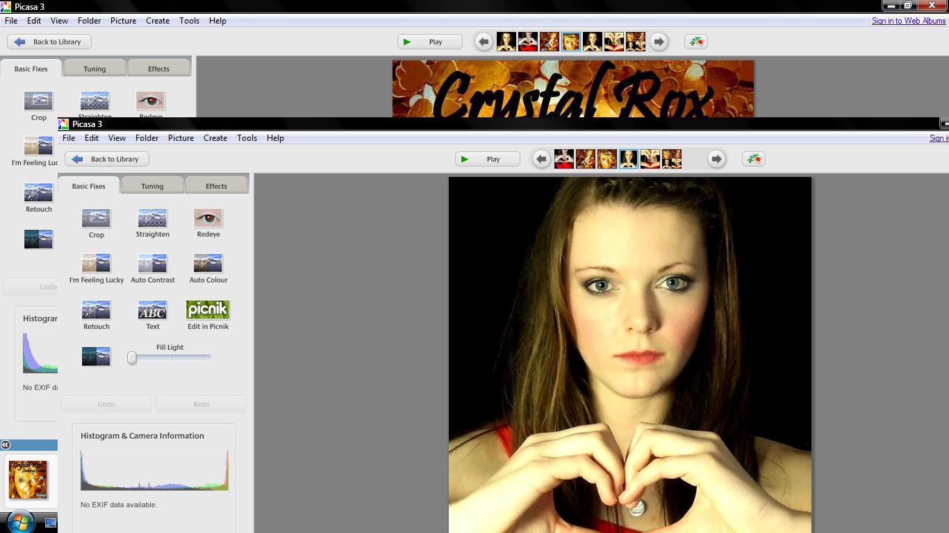 I then adjust the colour to make the inside booklet brighter. I also changed the brightness so the booklet cover will be eye capturing.
This is the inside booklet of my digipack.
This is the inside of the digipack, the heart shape is her logo and I feel that the photograph seems like the artist is looking at the buyer, this creates makes the fans seem special as she shows that she loves them. I decided to use a photograph of the artist in the inside booklet to show the fans her appreciation, I thought that the booklet could be filled with tour highlights so the photograph will entice the audience to look in the booklet.
For the inside to the digipak I wanted the viewer to feel like they knew the artist and that the audience felt appreciated for being a fan and buying the album.
Below is how I made the CD holder.
Creating the CD holder I simply cropped in to a photograph of the artist making a heart shape.
Then I created the circle of where to place the CD, the CD will be placed in the heart.
This is the final inside panel to my digipak. Above is the inside of my digipack where the CD will be kept, it is the same design as the booklet as it makes the CD seem personal. I decided to use the heart shape as it is the artists logo, the artist creates the heart shape is the music video which creates a connection between the music video and the digipak. On the leaflet inside of the digipak there is a mid shot photograph of the artist making the heart shape once again, this makes the fans feel apart of a special 'club' as they feel connected to the artist.
For the back cover I wanted to use the gold colour scheme again, although this time I wanted to incorporate red which is the clothing that the artist is wearing. Red often appears in our music video which creates synergy between the music video and the digipak.
 I used the same photograph of the gold sequins as I did on the front cover of the digipak. I cropped in to this image so it was an extreme close up.
  I cropped in to this photograph until it was a mid shot. After using the photograph of the artist and the gold sequin photograph I 'held' both of these images, then I clicked on 'Collage', which led me to the settings so I was able to create a 'Mosaic'. I was then able to create an image in image picture, but I had to adjust the translucency so the audience was able to see the bottom photograph.
 I then applied the album track list, a scan price tag, the small print which states that the songs belong to the artist and record label and that copyright is illegal, the executive producers and then I added the Virgin Records Label.
  The artist appears to be angelic in the back cover which contrasts with the front cover as she has a serious expression, the angelic feel entices the audience to buy the album as they feel a connection between them and the artist. I am happy with the back cover to the digipak as the audience sees a sensitive side to the artist which could imply that the songs will be meaningful.
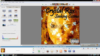
To create my digipak I downloaded Picasa 3 from http://picasa.google.com/mac/. I decided that I wanted to use a gold colour scheme for my front cover, because we wanted the artist to already seem established. I thought gold was a suitable colour as gold has connotations of wealth and power. Being an A Level photography student helped me a lot whilst creating my digipak as I already knew how to use the soft ware. Underneath is the process of how I made my front cover to my digipak 'Seeking Cosmo'.

 I then used Picasa to adjust the colour of the sequins to gold and I cropped in to the gold sequins to make an extreme close up shot.

 After, I included the artists name and the album title to the top of the digipak cover, after I included a 'Parental Advisory' sticker at the bottom right corner to make the digipak realistic.
  I am really pleased with how the digipak cover turned out and it is eye catching to the audience. The cover conforms and challenges the pop genre, as love is a frequent theme through pop so the hearts present love. But the cover does not have bright colours which challenges the pop genre, because I wanted to make the artist stand out from other female pop performers and the use of gold suits the album title 'Seeking Cosmo'.
 In our second edited draft we have tried to edit more on the beat and we have tried to make the audience recognise our artist by having more shots of our performer singing. In our latest draft we loved that the lyrics conformed with a shot in our video for example in the shot for "Just love" we had our artist moving a heart shape balloon which says 'I Love You', this makes a connection between the performer and the audience. We all liked the three cut away shots for "We", "Can", "Dance" as it makes the footage more on beat. When we asked our class what there favourite part was in our music video they said the seventeen photographs in the beginning, because they liked the editing technique. During the chorus we used fast pace editing with different shots of the artist in different location and the transvestite scenes. However, when I showed my mother our recent draft she thought the transvestite scenes were the performer, so we need to improve on that. We need to make our music video more fast pace because it is a pop music video. Also, we came to the realisation that we used the same shots for a long period of time for example, the artist performing in front of the black background is used in the beginning for twelve seconds and we do a shot reverse shot with the same performance. We have used many of the same performing shots so we have decided to film more performance to add interest in our music video, as it will not be so repetitive.
As a group we decided that we wanted Jess to do Michaela's make up when we filmed , Jess is an art student so she could do bold make up with delicate designs to not over shadow the artists face. Jess came up with the idea of including crystals on Michaela's face which conforms with our artists name and it will look glamourous which suits the pop genre. On the right side is the single artwork for Lady GaGa- Love Game which Jess got the inspiration from, the crystals areeye catching and it makes the artist seem more famous. We would place the crystals around M
 ichaelas's eyes as it will draw attention to her eyes. In Marina & The Diamonds video to 'I'm not a Robot' she had similar make up, the stillshot is on the left.We want to use a bold eye shadow colour as it draws the audience attention to her make up and it will appeal to our female target audience.
