

Front Cover:
Back Cover:
Inside the Digipak:

Final Digipak: This is my final digipack covers, from top left to right is the album cover, back of the album, inside booklet and inside where the CD will be held. I am really happy with how the photographs and editing of the photographs turned out, I decided to contrast the outside and the inside of the digipack as the outside is eye catching because of the bright gold and when looking closely the outline of the artist is apparent. But the inside of the digipack focuses on the artist, which connects the artist to the audience. The heart shape creates synergy between the digipak and the music video, which makes the audience recognise the artist and know the song.
Showing posts with label Album Cover. Show all posts
Showing posts with label Album Cover. Show all posts
Thursday, 10 February 2011
Final Digipack
Inside the Digipak (booklet)
For the inside booklet I wanted the audience to feel a connection between them and the artist, which is why I decided to have a photograph of the artist making a heart shape.
Below is how I created the inside booklet.
I cropped in to this photograph using Picasa.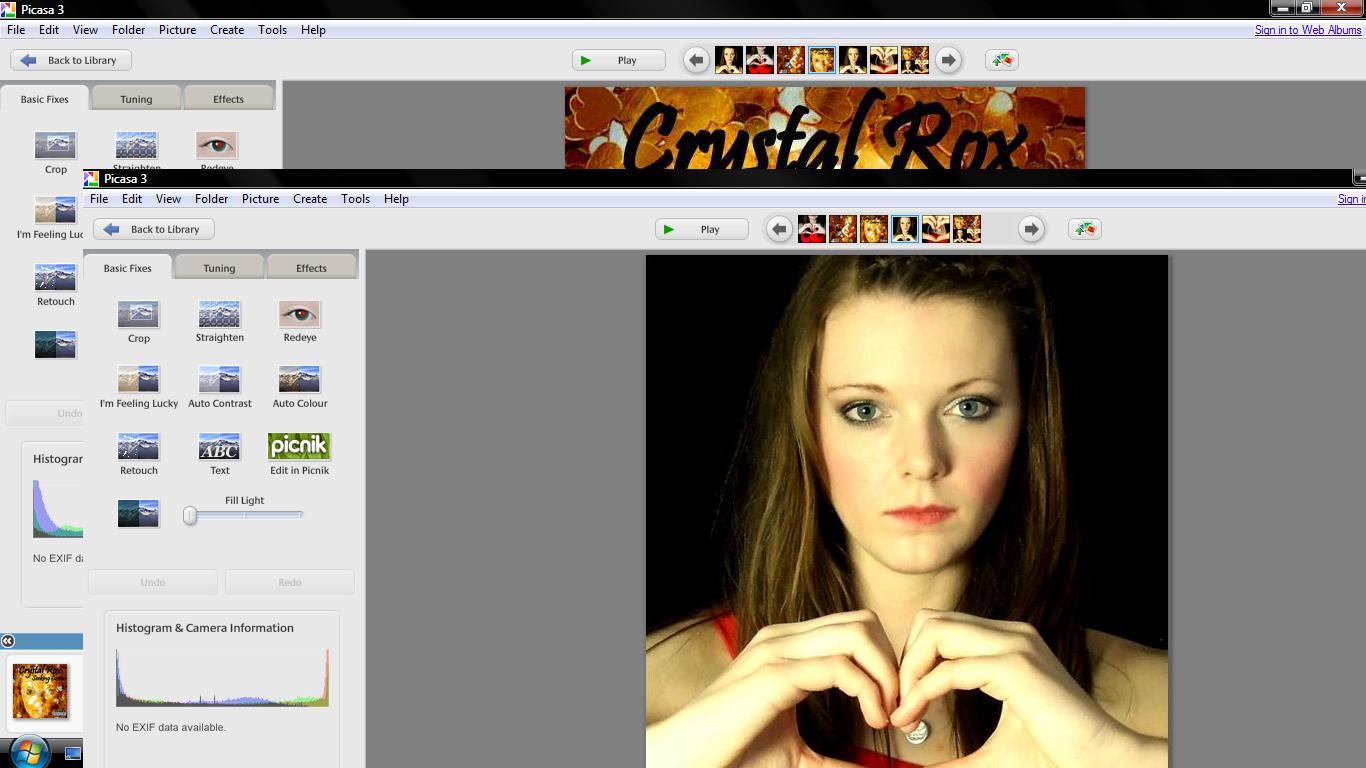 I then adjust the colour to make the inside booklet brighter. I also changed the brightness so the booklet cover will be eye capturing.
This is the inside booklet of my digipack.
This is the inside of the digipack, the heart shape is her logo and I feel that the photograph seems like the artist is looking at the buyer, this creates makes the fans seem special as she shows that she loves them. I decided to use a photograph of the artist in the inside booklet to show the fans her appreciation, I thought that the booklet could be filled with tour highlights so the photograph will entice the audience to look in the booklet.
Inside the Digipak
For the inside to the digipak I wanted the viewer to feel like they knew the artist and that the audience felt appreciated for being a fan and buying the album.
Below is how I made the CD holder.
Creating the CD holder I simply cropped in to a photograph of the artist making a heart shape.
Then I created the circle of where to place the CD, the CD will be placed in the heart.
This is the final inside panel to my digipak. Above is the inside of my digipack where the CD will be kept, it is the same design as the booklet as it makes the CD seem personal. I decided to use the heart shape as it is the artists logo, the artist creates the heart shape is the music video which creates a connection between the music video and the digipak. On the leaflet inside of the digipak there is a mid shot photograph of the artist making the heart shape once again, this makes the fans feel apart of a special 'club' as they feel connected to the artist.
Back Cover of my Digipak
For the back cover I wanted to use the gold colour scheme again, although this time I wanted to incorporate red which is the clothing that the artist is wearing. Red often appears in our music video which creates synergy between the music video and the digipak.
This is how I created the back cover to my digipak.
 I used the same photograph of the gold sequins as I did on the front cover of the digipak. I cropped in to this image so it was an extreme close up.
  I cropped in to this photograph until it was a mid shot. After using the photograph of the artist and the gold sequin photograph I 'held' both of these images, then I clicked on 'Collage', which led me to the settings so I was able to create a 'Mosaic'. I was then able to create an image in image picture, but I had to adjust the translucency so the audience was able to see the bottom photograph.
 I then applied the album track list, a scan price tag, the small print which states that the songs belong to the artist and record label and that copyright is illegal, the executive producers and then I added the Virgin Records Label.
 I asked my friends what they thought about the back cover they said "I really like the gold and the artist seems like an angel, but the font is unclear and hard to read". After receiving this feedback I tried to change the font to white but it was harder to read, as it blent in with some parts of the back ground. So I decided to leave the font black as it is bolder and clearer to read.
This is the back cover to the digipak.
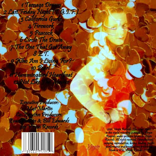 The artist appears to be angelic in the back cover which contrasts with the front cover as she has a serious expression, the angelic feel entices the audience to buy the album as they feel a connection between them and the artist. I am happy with the back cover to the digipak as the audience sees a sensitive side to the artist which could imply that the songs will be meaningful.
 The artist appears to be angelic in the back cover which contrasts with the front cover as she has a serious expression, the angelic feel entices the audience to buy the album as they feel a connection between them and the artist. I am happy with the back cover to the digipak as the audience sees a sensitive side to the artist which could imply that the songs will be meaningful.
Front Cover of my Digipak
To create my digipak I downloaded Picasa 3 from http://picasa.google.com/mac/. I decided that I wanted to use a gold colour scheme for my front cover, because we wanted the artist to already seem established. I thought gold was a suitable colour as gold has connotations of wealth and power. Being an A Level photography student helped me a lot whilst creating my digipak as I already knew how to use the soft ware. Underneath is the process of how I made my front cover to my digipak 'Seeking Cosmo'.

For the front cover I took a photograph of red heart sequins, love is a always portrayed in the pop genre so the hearts fitted well.
 I then used Picasa to adjust the colour of the sequins to gold and I cropped in to the gold sequins to make an extreme close up shot.

When I took a photograph of my artist I applied gold dust on her face, which was inspired by a photo shoot from America's Next Top Model. Using Picasa I then used 'held' the gold sequin photograph and the photograph of my artist and clicked on to 'Collage', after I went on to 'Settings' to make the photos become a 'Mosaic' and after I was allowed to drag one of the images in to the other. After I had to change the translucency to make the bottom photograph visible.
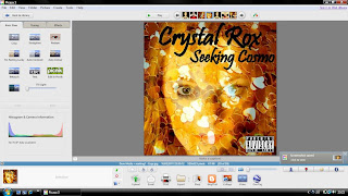 After, I included the artists name and the album title to the top of the digipak cover, after I included a 'Parental Advisory' sticker at the bottom right corner to make the digipak realistic.
 Below is my final front cover to my digipak.
 I am really pleased with how the digipak cover turned out and it is eye catching to the audience. The cover conforms and challenges the pop genre, as love is a frequent theme through pop so the hearts present love. But the cover does not have bright colours which challenges the pop genre, because I wanted to make the artist stand out from other female pop performers and the use of gold suits the album title 'Seeking Cosmo'.
 Monday, 7 February 2011
Album Title Logo
After analysing Lady GaGa- The Fame I became really interested in to the layout of the album cover such as, the close up photograph of the artist, the logo and the composition of the artist name and the album title. Initially, I thought that I would have the logo of a crystal but I have decided against that because I am already using glitter or confetti to represent crystals. So I have thought about portraying love in the album cover, as our artists songs are about love. These are two examples that I found on Google which I really liked and I could imagine using on the spine on the album cover.

Idea for Logo (One)
I can imagine using this image on the spine of the album cover but I do not know where I would include it, on the front of the album cover as it is a close up shot of the artist.

Idea for Logo (Two)
I would really like to use a shot like this in our music video as it portrays the love in the song. On the spine I can imagine the arm being stretched across, with the hand in the shape of a heart in the middle of the spine.
Tuesday, 25 January 2011
Album Cover Idea (One)
Album Cover Ideas

In our artists album cover 'Crystal Rox', I want to include a close up shot of her face as she is a new artist and the artist needs to be recognisable to the buyer. I have thought about including an aspect of the artist
s name in to the album cover. However, I thought about including a crystal in the album (the artist could be holding it)
but when after further research I had found out that Lady GaGas album 'The Fame' has a crystal microphone, I want the album cover to be unique so I will not use the crystal. Whilst researching CD covers I came across Ke$has single cover for 'Tik Tok' (left) and I really liked that her glitter eye shadow matches the glitter that she blew in her hand. I have decided to include glitter as it gives a crystal feeling but I will not have our artist blowing the glitter.

The image on the left is a photo shoot from America's Next Top Model, I tried to think how I could include glitter with out copying Ke$ha. I thought about using glitter paint on our artists face. I would put silver, grey or black glitter eye shadow around her eyes and i would apply black lip stick. Although, I am worried that artists emotion and personality will not show through the glitter and dramatic make up and our artist may look too young for such dramatic make up. So I have decided to not use this idea as it could limit our target audience, as it could be controversial.

I love this photograph from America's Next Top Model and I woud like to use this photograph to inspire me for the album cover. I will sprinkle glitter across our artists face but I do not know the colour I will use yet, even though crystals are silver, I do not think silver would stand out due to the lighting so I may use black glitter. I will use a black background for the photo shoot and I will have Michaelas (our artist) hair tied back but I may have some curly strands of her hair down. I love that in the photo shoot the models look innocent but the dramatic make up portrays them as rebellious, which would suit the album cover perfectly.
(Draw album cover idea)
Subscribe to:
Posts (Atom)
