

Whilst researching Final Cut Pro I came across a variety of films and television programmes that have used Final Cut Pro, this was eye opening to me as I have never realised how popular and professional the programme is.
True Grit which was directed by The Coen Brothers was edited by Final Cut Pro. True Grit was nominated for many BAFTA awards and it is said to be the 'film of 2011'. Eat Pray Love which is a best selling memoir used Final Cut Pro through all of the editing stage. (500) Days of Summer which was directed by Marc Webb, who was a first time director and the editor Alan Bell had used Final Cut Pro. I was very suprised that the blockbuster film Benjamin Button had used Final Cut Pro, the film was the director's, David Fincher, biggest film to date. Sundance 2008 Festival "Best Director" Lance Hammer, used Final Cut Pro for his new film Ballast.
Also, television programmes such as Everybody Hates Chris, X-Files and Live From Abby Road.
All of this information was Quoted from www.apple.com/finalcutstudio/in-action.
(I wrote this post using my I Phone).
Friday, 25 February 2011
Final Cut Pro used in Movies
Glee

Filming Technique
Whilst watching the music video to You Me At Six- Gossip (above) I noticed that the majority of the music video were dolly shots, I wondered how they made the dolly shots seem so smooth and professional even though it was a low budget music video. So I then decided to rese arch in to the filming technique that they used.
 on a poll with wheels which was used for the dolly
Sunday, 13 February 2011
The Orange British Academy Film Awards

Sun, Sex and Suspicious Parents

Thursday, 10 February 2011
Final Digipack
Front Cover:
Back Cover:
Inside the Digipak:

Final Digipak: This is my final digipack covers, from top left to right is the album cover, back of the album, inside booklet and inside where the CD will be held. I am really happy with how the photographs and editing of the photographs turned out, I decided to contrast the outside and the inside of the digipack as the outside is eye catching because of the bright gold and when looking closely the outline of the artist is apparent. But the inside of the digipack focuses on the artist, which connects the artist to the audience. The heart shape creates synergy between the digipak and the music video, which makes the audience recognise the artist and know the song.
Inside the Digipak (booklet)
For the inside booklet I wanted the audience to feel a connection between them and the artist, which is why I decided to have a photograph of the artist making a heart shape.
Below is how I created the inside booklet.
I cropped in to this photograph using Picasa.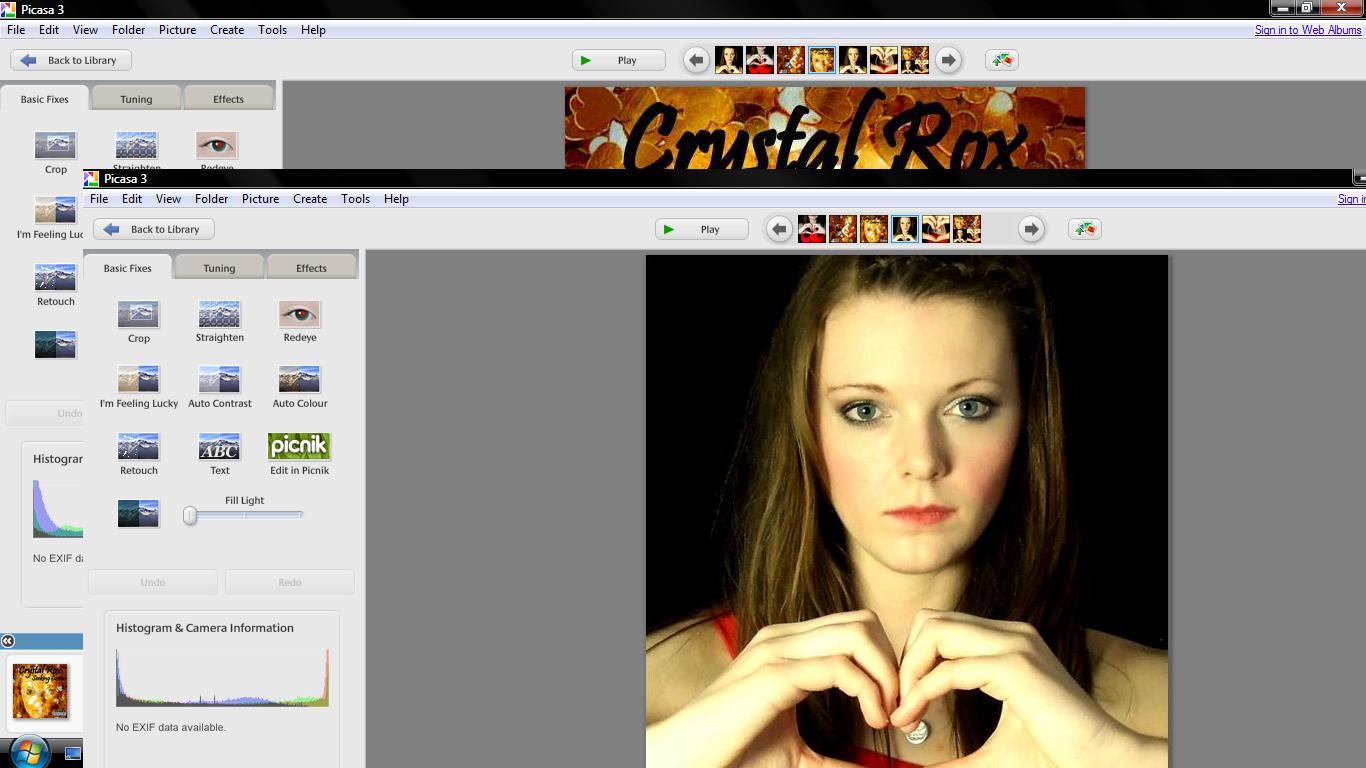 I then adjust the colour to make the inside booklet brighter. I also changed the brightness so the booklet cover will be eye capturing.
This is the inside booklet of my digipack.
This is the inside of the digipack, the heart shape is her logo and I feel that the photograph seems like the artist is looking at the buyer, this creates makes the fans seem special as she shows that she loves them. I decided to use a photograph of the artist in the inside booklet to show the fans her appreciation, I thought that the booklet could be filled with tour highlights so the photograph will entice the audience to look in the booklet.
Inside the Digipak
For the inside to the digipak I wanted the viewer to feel like they knew the artist and that the audience felt appreciated for being a fan and buying the album.
Below is how I made the CD holder.
Creating the CD holder I simply cropped in to a photograph of the artist making a heart shape.
Then I created the circle of where to place the CD, the CD will be placed in the heart.
This is the final inside panel to my digipak. Above is the inside of my digipack where the CD will be kept, it is the same design as the booklet as it makes the CD seem personal. I decided to use the heart shape as it is the artists logo, the artist creates the heart shape is the music video which creates a connection between the music video and the digipak. On the leaflet inside of the digipak there is a mid shot photograph of the artist making the heart shape once again, this makes the fans feel apart of a special 'club' as they feel connected to the artist.
Back Cover of my Digipak
For the back cover I wanted to use the gold colour scheme again, although this time I wanted to incorporate red which is the clothing that the artist is wearing. Red often appears in our music video which creates synergy between the music video and the digipak.
 I used the same photograph of the gold sequins as I did on the front cover of the digipak. I cropped in to this image so it was an extreme close up.
  I cropped in to this photograph until it was a mid shot. After using the photograph of the artist and the gold sequin photograph I 'held' both of these images, then I clicked on 'Collage', which led me to the settings so I was able to create a 'Mosaic'. I was then able to create an image in image picture, but I had to adjust the translucency so the audience was able to see the bottom photograph.
 I then applied the album track list, a scan price tag, the small print which states that the songs belong to the artist and record label and that copyright is illegal, the executive producers and then I added the Virgin Records Label.
  The artist appears to be angelic in the back cover which contrasts with the front cover as she has a serious expression, the angelic feel entices the audience to buy the album as they feel a connection between them and the artist. I am happy with the back cover to the digipak as the audience sees a sensitive side to the artist which could imply that the songs will be meaningful.
Front Cover of my Digipak
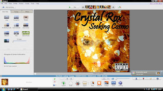
To create my digipak I downloaded Picasa 3 from http://picasa.google.com/mac/. I decided that I wanted to use a gold colour scheme for my front cover, because we wanted the artist to already seem established. I thought gold was a suitable colour as gold has connotations of wealth and power. Being an A Level photography student helped me a lot whilst creating my digipak as I already knew how to use the soft ware. Underneath is the process of how I made my front cover to my digipak 'Seeking Cosmo'.

 I then used Picasa to adjust the colour of the sequins to gold and I cropped in to the gold sequins to make an extreme close up shot.

 After, I included the artists name and the album title to the top of the digipak cover, after I included a 'Parental Advisory' sticker at the bottom right corner to make the digipak realistic.
  I am really pleased with how the digipak cover turned out and it is eye catching to the audience. The cover conforms and challenges the pop genre, as love is a frequent theme through pop so the hearts present love. But the cover does not have bright colours which challenges the pop genre, because I wanted to make the artist stand out from other female pop performers and the use of gold suits the album title 'Seeking Cosmo'.
 Editing Draft (Two)
In our second edited draft we have tried to edit more on the beat and we have tried to make the audience recognise our artist by having more shots of our performer singing. In our latest draft we loved that the lyrics conformed with a shot in our video for example in the shot for "Just love" we had our artist moving a heart shape balloon which says 'I Love You', this makes a connection between the performer and the audience. We all liked the three cut away shots for "We", "Can", "Dance" as it makes the footage more on beat. When we asked our class what there favourite part was in our music video they said the seventeen photographs in the beginning, because they liked the editing technique. During the chorus we used fast pace editing with different shots of the artist in different location and the transvestite scenes. However, when I showed my mother our recent draft she thought the transvestite scenes were the performer, so we need to improve on that. We need to make our music video more fast pace because it is a pop music video. Also, we came to the realisation that we used the same shots for a long period of time for example, the artist performing in front of the black background is used in the beginning for twelve seconds and we do a shot reverse shot with the same performance. We have used many of the same performing shots so we have decided to film more performance to add interest in our music video, as it will not be so repetitive.
Tuesday, 8 February 2011
Make Up Ideas
As a group we decided that we wanted Jess to do Michaela's make up when we filmed , Jess is an art student so she could do bold make up with delicate designs to not over shadow the artists face. Jess came up with the idea of including crystals on Michaela's face which conforms with our artists name and it will look glamourous which suits the pop genre. On the right side is the single artwork for Lady GaGa- Love Game which Jess got the inspiration from, the crystals areeye catching and it makes the artist seem more famous. We would place the crystals around M
 ichaelas's eyes as it will draw attention to her eyes. In Marina & The Diamonds video to 'I'm not a Robot' she had similar make up, the stillshot is on the left.We want to use a bold eye shadow colour as it draws the audience attention to her make up and it will appeal to our female target audience.
Monday, 7 February 2011
Performance Ideas
 the music video interesting and to keep the audience entertained, as our music video is mostly performance. We will have Kayla performing in front of a white and black back drop because we really liked that is portrays sophistication, Kayla will wear different colour dresses to make her stand out. After watching Adele- Rolling in the Deep (screenshot on the right) we decided that we wanted to have a background that would be unusual, we found it intriguing that where Adele is performing in the beginning of the video, later the video goes back to the same location but Adele is not there.
 edia room or the hall, of a location. In B.O.B featuring Hayley Williams- Airplanes (left) most performance shots are in front of a projector. We loved that we could create any location using the projector and we in the song there is a lyric 'Let's runaway and don't ever look back', so a different locat
 ion would suit our music video. We thought about having the picture on the projector as a field and in the end of the video Lewis opens the door so we could then have a cut away shot of Kayla in a field letting a balloon in the shape of a heart go. Which is similar to the picture on the right.
Editing Draft (One)
In Fridays lesson we started editing the footage that we recently filming. We placed all our shots that we want to film in order and we have left black screens with wr iting indicating what shots we want, as we have yet to film the performance with Kayla. We have had difficulties with the transition as we did not know whether we should make it seem like Lewis is re-living the moment whichwas filmed on Fireworks night or weshould have a cut away shot of Kayla performing (shown on the right). We have not resolved this problem so we have decided to wait until wehave filmed both and see our class opinions.
Album Title Logo
After analysing Lady GaGa- The Fame I became really interested in to the layout of the album cover such as, the close up photograph of the artist, the logo and the composition of the artist name and the album title. Initially, I thought that I would have the logo of a crystal but I have decided against that because I am already using glitter or confetti to represent crystals. So I have thought about portraying love in the album cover, as our artists songs are about love. These are two examples that I found on Google which I really liked and I could imagine using on the spine on the album cover.


Album Title


Thursday, 3 February 2011
Filming and Finalising Shots
Today we finalised all of the shots that we wanted to film later on in the day, we created a separate storyboard for the shots that we needed to film today. We have decided to re-film some shots as we thought that we did not hide that Lewis is a boy. After school we went to Emilys house to film with Lewis and my friend India came to film as well, to give usthe audience perspective of the different shots and the narrative. Filming last year in ASfor our opening to a film we found that some times we missed the small details in the back ground for example, a modern car parking sign was on the wall which could of ruined the time period piece. So having a friend watching our filming helped a lot as she noticed things that we did not. We have filmed Lewis applying make up, Lewis in womens clothes, Lewis meeting Emily (his girlfriend) and we filmed the transformation between boy and girlat the end of the video. Overall I am very happy with the filming, how well we worked as a group and the co-operation between us and Lewis and I am very thankful that he was willing to film. Tomorrow we are going to upload all of the footage that we filmed tonight.
