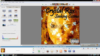
To create my digipak I downloaded Picasa 3 from http://picasa.google.com/mac/. I decided that I wanted to use a gold colour scheme for my front cover, because we wanted the artist to already seem established. I thought gold was a suitable colour as gold has connotations of wealth and power. Being an A Level photography student helped me a lot whilst creating my digipak as I already knew how to use the soft ware. Underneath is the process of how I made my front cover to my digipak 'Seeking Cosmo'.

For the front cover I took a photograph of red heart sequins, love is a always portrayed in the pop genre so the hearts fitted well.
 I then used Picasa to adjust the colour of the sequins to gold and I cropped in to the gold sequins to make an extreme close up shot.
When I took a photograph of my artist I applied gold dust on her face, which was inspired by a photo shoot from America's Next Top Model. Using Picasa I then used 'held' the gold sequin photograph and the photograph of my artist and clicked on to 'Collage', after I went on to 'Settings' to make the photos become a 'Mosaic' and after I was allowed to drag one of the images in to the other. After I had to change the translucency to make the bottom photograph visible.
 After, I included the artists name and the album title to the top of the digipak cover, after I included a 'Parental Advisory' sticker at the bottom right corner to make the digipak realistic.
 Below is my final front cover to my digipak.
 I am really pleased with how the digipak cover turned out and it is eye catching to the audience. The cover conforms and challenges the pop genre, as love is a frequent theme through pop so the hearts present love. But the cover does not have bright colours which challenges the pop genre, because I wanted to make the artist stand out from other female pop performers and the use of gold suits the album title 'Seeking Cosmo'.


0 comments:
Post a Comment