

For the back cover I wanted to use the gold colour scheme again, although this time I wanted to incorporate red which is the clothing that the artist is wearing. Red often appears in our music video which creates synergy between the music video and the digipak.
This is how I created the back cover to my digipak.
 I used the same photograph of the gold sequins as I did on the front cover of the digipak. I cropped in to this image so it was an extreme close up.
  I cropped in to this photograph until it was a mid shot. After using the photograph of the artist and the gold sequin photograph I 'held' both of these images, then I clicked on 'Collage', which led me to the settings so I was able to create a 'Mosaic'. I was then able to create an image in image picture, but I had to adjust the translucency so the audience was able to see the bottom photograph.
 I then applied the album track list, a scan price tag, the small print which states that the songs belong to the artist and record label and that copyright is illegal, the executive producers and then I added the Virgin Records Label.
 I asked my friends what they thought about the back cover they said "I really like the gold and the artist seems like an angel, but the font is unclear and hard to read". After receiving this feedback I tried to change the font to white but it was harder to read, as it blent in with some parts of the back ground. So I decided to leave the font black as it is bolder and clearer to read.
This is the back cover to the digipak.
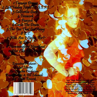 The artist appears to be angelic in the back cover which contrasts with the front cover as she has a serious expression, the angelic feel entices the audience to buy the album as they feel a connection between them and the artist. I am happy with the back cover to the digipak as the audience sees a sensitive side to the artist which could imply that the songs will be meaningful.
 The artist appears to be angelic in the back cover which contrasts with the front cover as she has a serious expression, the angelic feel entices the audience to buy the album as they feel a connection between them and the artist. I am happy with the back cover to the digipak as the audience sees a sensitive side to the artist which could imply that the songs will be meaningful.
0 comments:
Post a Comment