Framing and composition is important in any shot as it is used to draw in the audience, make the shot stand out and to portray the characters importance. Being a photography student I understand t he concept of framing and composition, however I need to learn how to use a range of framing and composition to create an interesting shot.
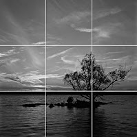
This is taken from http://en.wikipedia.org/wiki/Rule_of_thirds to specify the definition of The Rule of Thirds.

The rule states that an image should be imagined as divided into nine equal parts by two equally-spaced horizontal lines and two equally-spaced vertical lines, and that important compositional elements should be placed along these lines or their intersections. Proponents of the technique claim that aligning a subject with these points creates more tension, energy and interest in the composition than simply centering the subject would.
The meanings are taken from http://www.tutorial9.net/photography/composition-and-framing/
Look for natural frames in the scenery you have, it can be anything at all; having some frames can do wonders for a photograph.
Try to never cut off a small part of an object, such as a person’s hand or the ear or tail of an animal. If you leave an entire arm outside the frame it usually doesn’t look odd, but if there’s something small like a hand missing the viewer will notice it in a different way and it can be very distracting at times.
Try to never cut off a small part of an object, such as a person’s hand or the ear or tail of an animal. If you leave an entire arm outside the frame it usually doesn’t look odd, but if there’s something small like a hand missing the viewer will notice it in a different way and it can be very distracting at times.
Lines and Shapes
Lines and shapes are everywhere; try to use them to your advantage. They can draw the viewer into the picture or they can guide the eyes to a point that you normally wouldn’t pay so much attention to. Both symmetrical and asymmetrical lines and shapes are a great asset.
 Simplicity
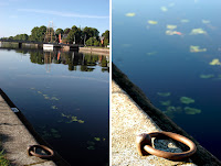
Focus on the small things instead of the entire scene this obviously won’t work for every scene you’re shooting but as a quick rule it’s often good to keep your compositions clutter free and with less distractions. The “only” difference here is that I isolated the object in the second photo, this helps the few things stands out more. Metal, stone, wood and water simple and clean.
 Empty Space
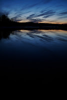
Negative space should not be underestimated, it can be a great way to simplify your image and draw attention to a certain point in the photograph. Don’t be afraid to use empty spaces in your photographs. Empty spaces usually work very well in portraits as, just keep in mind that it’s often preferred that the model either looks towards you or into the space so to speak. A common rule says that there should always be more space in front of a moving object than behind it. If there’s not enough space in front of the object we often get the mental picture that it’s going to crash.
Eye Level
Try to photograph on the same height as your object, be it a child, a pet or a small bird. Instead of photographing the child from your viewpoint some 6 feet above ground try to get down on their level and get eye contact, this creates a totally different feeling as you become a part of their world. If you get down on their level they usually respond to you in a different way and this will often give you photographs that would not be possible for another angle.


0 comments:
Post a Comment